I applied Python time series analysis on NYC metro turnstile data to identify which subway line had the most traffic over a week period in January 2016. This project showcases data wrangling techniques, time series manipulation, and visualization of large-scale public transit data.
Table of Contents
Introduction
For this project, I worked with NYC's MTA turnstile data to analyze subway traffic patterns. The goal was straightforward: determine which line experiences the highest volume of commuter activity during a typical week. I chose January 2016 data - a period representing normal winter commuting patterns without holiday anomalies.
The technical challenge here wasn't just parsing ~20,000 rows of data, but handling inconsistent audit intervals, negative counter values from turnstile resets, and distributing activity across multiple lines serving the same station.
Imports
import datetime
from datetime import datetime
from datetime import timedelta
import time
import numpy as np
import matplotlib.pyplot as plt
import matplotlib.patches as mpatches
import matplotlib.pyplot as plt
import csv as csv
import requests
%matplotlib inline
from IPython.display import Image
Data
The NYC MTA provides turnstile data in CSV format with approximately 20,000 rows per week. Here's what a sample looks like:
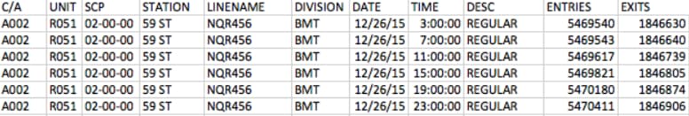
Understanding the data structure was critical. Each row represents an audit event from a specific turnstile device:
- C/A = Control Area (A002)
- UNIT = Remote Unit for a station (R051)
- SCP = Subunit Channel Position represents a specific address for a device (02-00-00)
- STATION = The station name where the device is located
- LINENAME = All train lines accessible at this station. For example, LINENAME 456NQR indicates service for the 4, 5, 6, N, Q, and R trains.
- DIVISION = The original line the station belonged to: BMT, IRT, or IND
- DATE = Date in MM-DD-YY format
- TIME = Time in hh:mm:ss format for a scheduled audit event
- DESC = Describes the audit type, typically "REGULAR" (occurs every 4 hours)
- Audits may occur at intervals greater than 4 hours due to maintenance or troubleshooting
- "RECOVR AUD" entries indicate recovered missed audits
- ENTRIES = Cumulative entry register value for the device
- EXITS = Cumulative exit register value for the device
Line Data Function
The core of my analysis lies in this function. I needed to calculate activity per line while handling several data quality issues:
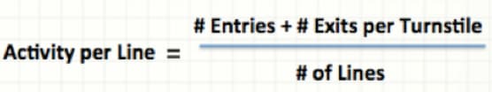
The equation above represents the critical calculation in my read_csv function. It computes activity for each line based on the turnstile ID (SCP, UNIT, STATION), then aggregates this into the total for each line serving that station.
I implemented several data cleaning steps:
- Fixed negative entry/exit values by taking absolute values for differences less than -15,000 (indicating counter resets)
- Set values below -15,000 to zero (likely erroneous readings)
- Normalized time intervals to consistent 4-hour windows (3:00, 7:00, 11:00, 15:00, 19:00, 23:00)
def read_csv(filename):
    prevTurnstileID = ''
    old_row = ''
    lineData = {}
    ideal_time = (3, 7, 11, 15, 19, 23)
    with open(filename, 'rU') as f:
        reader = csv.reader(f)
        reader.next()
        for row in reader:
            unit = row[1]
            scp = row[2]
            station = row[3]
            lines = row[4]
            date = row[6]
            time = row[7]
            turnstileID = (scp, unit, station)
            date_time = datetime.strptime(date + " " + time, "%m/%d/%Y %H:%M:%S")
            entries = int(row[9])
            exits = int(row[10])
            '''
            We are testing to see if our current turnstile is the same as the previous turnstile.  If it is, we can deduct the current
            entries and exits from the previous ones to determine the total entries and exits for the difference in time.

            '''
            if turnstileID == prevTurnstileID:
                difEntries = entries - prevEntries
                difExits = exits - prevExits
                if difEntries < -15000:
                    print "DifEntries: %s" % difEntries
                    difEntries = 0
                elif difEntries < 0:
                    difEntries = abs(difEntries)
                if difExits < -15000:
                    print "DifExits: %s" % difExits
                    difExits = 0
                elif difExits < 0:
                    difExits = abs(difExits)
                numLines = len(lines)
                averAct = (difEntries + difExits)/numLines
                for line in lines:
                    if date_time.minute >= 30:
                        date_time += timedelta(hours = 1)
                        date_time = date_time.replace(minute=0, second=0)
                    elif date_time.minute < 30 and date_time.minute != 0:
                        date_time -= timedelta(hours = 1)
                        date_time = date_time.replace(minute=0, second=0)
                    if date_time.hour not in ideal_time:
                        #print('not in ideal_time zomg')
                        if date_time.hour < 3:
                            date_time = date_time.replace(hour=3)
                        else:
                            for val in ideal_time:
                                if abs(date_time.hour - val) <= 2:
                                    date_time = date_time.replace(hour=val)

                    if line in lineData:
                        if str(date_time) in lineData[line]:
                            lineData[line][str(date_time)] += averAct
                        else:
                            lineData[line][str(date_time)] = averAct
                    else:
                        lineData[line] = {str(date_time): averAct}
            prevTurnstileID = turnstileID
            prevEntries = entries
            prevExits = exits
            old_row = row
        return lineData
The output is a nested dictionary structure where each line maps to timestamps and their corresponding activity values:
lineData={'1': {'2016-01-11 07:00:00': 74, '2016-01-10 15:00:00': 320, '2016-01-11 11:00:00': 776, '2016-01-11 03:00:00': 23, '2016-01-10 19:00:00': 317, '2016-01-10 23:00:00': 139},
          'N': {'2016-01-09 07:00:00': 3, '2016-01-09 23:00:00': 51, '2016-01-09 15:00:00': 55, '2016-01-09 19:00:00': 75, '2016-01-09 11:00:00': 31, '2016-01-10 03:00:00': 17},
          'Q': {'2016-01-09 07:00:00': 3, '2016-01-09 23:00:00': 51, '2016-01-09 15:00:00': 55, '2016-01-09 19:00:00': 75, '2016-01-09 11:00:00': 31, '2016-01-10 03:00:00': 17},
          '3': {'2016-01-09 19:00:00': 597, '2016-01-09 23:00:00': 403, '2016-01-12 19:00:00': 691, '2016-01-09 07:00:00': 229, '2016-01-13 03:00:00': 75, '2016-01-09 15:00:00': 513, '2016-01-15 08:00:00': 189, '2016-01-14 08:00:00': 180, '2016-01-15 04:00:00': 25, '2016-01-14 04:00:00': 15, '2016-01-14 12:00:00': 390, '2016-01-15 00:00:00': 125, '2016-01-09 11:00:00': 427, '2016-01-12 23:00:00': 295, '2016-01-14 16:00:00': 312, '2016-01-14 20:00:00': 393, '2016-01-10 03:00:00': 226},
          'R': {'2016-01-09 07:00:00': 3, '2016-01-09 23:00:00': 51, '2016-01-09 15:00:00': 55, '2016-01-09 19:00:00': 75, '2016-01-09 11:00:00': 31, '2016-01-10 03:00:00': 17},
          '5': {'2016-01-11 12:00:00': 313, '2016-01-10 07:00:00': 46, '2016-01-09 07:00:00': 83, '2016-01-12 04:00:00': 9, '2016-01-09 23:00:00': 314, '2016-01-09 15:00:00': 494, '2016-01-11 08:00:00': 378, '2016-01-09 19:00:00': 487, '2016-01-11 20:00:00': 302, '2016-01-12 00:00:00': 74, '2016-01-12 12:00:00': 307, '2016-01-11 16:00:00': 309, '2016-01-09 11:00:00': 358, '2016-01-12 08:00:00': 447, '2016-01-10 03:00:00': 131},
          '4': {'2016-01-09 07:00:00': 3, '2016-01-09 23:00:00': 51, '2016-01-09 15:00:00': 55, '2016-01-09 19:00:00': 75, '2016-01-09 11:00:00': 31, '2016-01-10 03:00:00': 17},
          '7': {'2016-01-13 15:00:00': 490, '2016-01-12 19:00:00': 1048, '2016-01-13 03:00:00': 97, '2016-01-12 23:00:00': 490, '2016-01-13 07:00:00': 148, '2016-01-13 11:00:00': 794},
          '6': {'2016-01-09 07:00:00': 3, '2016-01-09 23:00:00': 51, '2016-01-09 15:00:00': 55, '2016-01-09 19:00:00': 75, '2016-01-09 11:00:00': 31, '2016-01-10 03:00:00': 17},
          '2': {'2016-01-09 19:00:00': 412, '2016-01-09 23:00:00': 263, '2016-01-09 07:00:00': 80, '2016-01-09 15:00:00': 439, '2016-01-10 07:00:00': 46, '2016-01-15 08:00:00': 189, '2016-01-14 08:00:00': 180, '2016-01-15 04:00:00': 25, '2016-01-14 04:00:00': 15, '2016-01-14 12:00:00': 390, '2016-01-15 00:00:00': 125, '2016-01-09 11:00:00': 327, '2016-01-14 16:00:00': 312, '2016-01-14 20:00:00': 393, '2016-01-10 03:00:00': 114}}
Plotting Line Activity
For visualization, I mapped each line to its official MTA colors and created distinct line styles for clarity when multiple lines share the same color:
lineColors={"A":"#2850ad","C":"#2850ad","E":"#2850ad",
            "B":"#ff6319","D":"#ff6319","F":"#ff6319","M":"#ff6319",
            "G":"#6cbe45",
            "L":"#a7a9ac",
            "J":"#996633","Z":"#996633",
            "N":"#fccc0a","Q":"#fccc0a","R":"#fccc0a",
            "1":"#ee352e","2":"#ee352e","3":"#ee352e",
            "4":"#00933c","5":"#00933c","6":"#00933c",
            "7":"#b933ad",
            "S":"#808183"}
lineStyles={"A":"-","C":":","E":"-.",
            "B":"-","D":":","F":"-.","M":"--",
            "G":"-",
            "L":"-",
            "J":"-","Z":":",
            "N":"-","Q":":","R":"-.",
            "1":"-","2":":","3":"-.",
            "4":"-","5":":","6":"-.",
            "7":"-",
            "S":"-"}
I built a helper function to transform the lineData dictionary into plottable time series:
plotList=[]
import time
def addLine(thisLine):
    lineTimeData={}
    for eachTime in lineData[thisLine]:
        tempTime = datetime.strptime(eachTime, "%Y-%m-%d %H:%M:%S")
        lineTimeData[tempTime] = lineData[thisLine][eachTime]
    timeList = lineTimeData.keys()
    timeList.sort()
    activityList=[]
    for eachTime in timeList:
        activityList.append(lineTimeData[eachTime])
    labelName = 'Line ' + thisLine
    line1_patch = mpatches.Patch(color=lineColors[thisLine], label=labelName)
    # plt.legend(handles=[line1_patch])
    plt.plot(timeList, activityList, linewidth=2,color=lineColors[thisLine],label=labelName,linestyle=lineStyles[thisLine])
    thisPlot, = plt.plot(timeList, activityList, linewidth=2,color=lineColors[thisLine],label=labelName,linestyle=lineStyles[thisLine])
    plotList.append(thisPlot)
The main execution code ties everything together - reading the CSV, processing each line, and generating the visualization:
filename = './turnstile_160109.csv'
lineData = read_csv(filename)

for eachLine in lineData:
    addLine(eachLine)

plt.legend(handles=plotList,bbox_to_anchor=(1,1),bbox_transform=plt.gcf().transFigure)
plt.grid()
plt.suptitle('Total Activity Per NYC Metro Line', fontsize=28)
plt.xlabel('Time (Days)',fontsize='18')
plt.ylabel('Activity (Entries + Exits)',fontsize='18')
plt.axis('tight')
plt.show()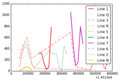
Here's a detailed view of the activity patterns:

Key observations from the visualization:
- Y Axis: Activity ranges from 0 to 35,000 combined entries and exits
- X Axis: Timeline spans the first week of January 2016
- Legend: Each line is color-coded according to official MTA branding
Conclusion
The data clearly shows that NYC's N line dominates in terms of raw commuter volume during this period. The N line's route explains this: it connects Queens to Manhattan's midtown, passes through Times Square (34th Street), continues down to Union Square (14th Street), and terminates in Brooklyn - hitting virtually every major business and transit hub in the city.
From a data analysis perspective, this project demonstrates the importance of robust data cleaning when working with real-world sensor data. The turnstile counters reset, audits miss scheduled intervals, and stations serve multiple lines - all challenges I addressed in the processing pipeline.
Future enhancements I'm considering:
- Refining the activity distribution algorithm for multi-line stations (currently using simple averaging)
- Modeling line dependencies and transfer patterns between lines
- Expanding the analysis to cover full monthly or yearly cycles to identify seasonal trends
- Incorporating external factors like weather, events, and service disruptions