API Prioritization Framework
To prioritize our data roadmap intelligently, we quantitatively ranked all 121 API and data feeds on two dimensions: Value (strategic payoff) and Effort (implementation difficulty). Using a 10-criterion scoring model, each feed receives a normalized 1–5 score for Value and Effort, along with an overall weighted score that blends strategic impact (61%) with engineering feasibility (39%). This framework allows us to compare feeds objectively, identify high-ROI additions, and allocate resources where they create the strongest leverage. In essence, it helps us both strategic payoff and implementation feasibility
Purpose: Quantitatively rank 121 API/data feeds by Value vs. Effort to guide roadmap and resourcing
Framework Summary
|
Dimension |
Criterion |
Weight |
Meaning of 5 (Best) |
|
💎 Value (0.61) |
ChatGPT Coverage / Uniqueness |
0.20 |
Proprietary or unique data |
|
|
Data Availability |
0.14 |
Real-time + historical access |
|
|
Data Uniformity |
0.12 |
Standardized, ready-to-ingest |
|
|
Cost (Value) |
0.09 |
Enterprise-grade reliability |
|
|
Scalability / Rate Limits |
0.07 |
High throughput, minimal throttling |
|
⚙️ Effort (0.39) |
Implementation Complexity |
0.18 |
Simple, low-risk build |
|
|
Cost (Effort) |
0.08 |
Free / open = low friction |
|
|
Integration Readiness |
0.06 |
Clear docs, fast setup |
|
|
Connectivity / Access |
0.04 |
REST-first, stable |
|
|
Authentication Model |
0.02 |
Simple key/token |
|
|
Data Size / Quantity |
0.01 |
Manageable volume |
Quadrant Chart
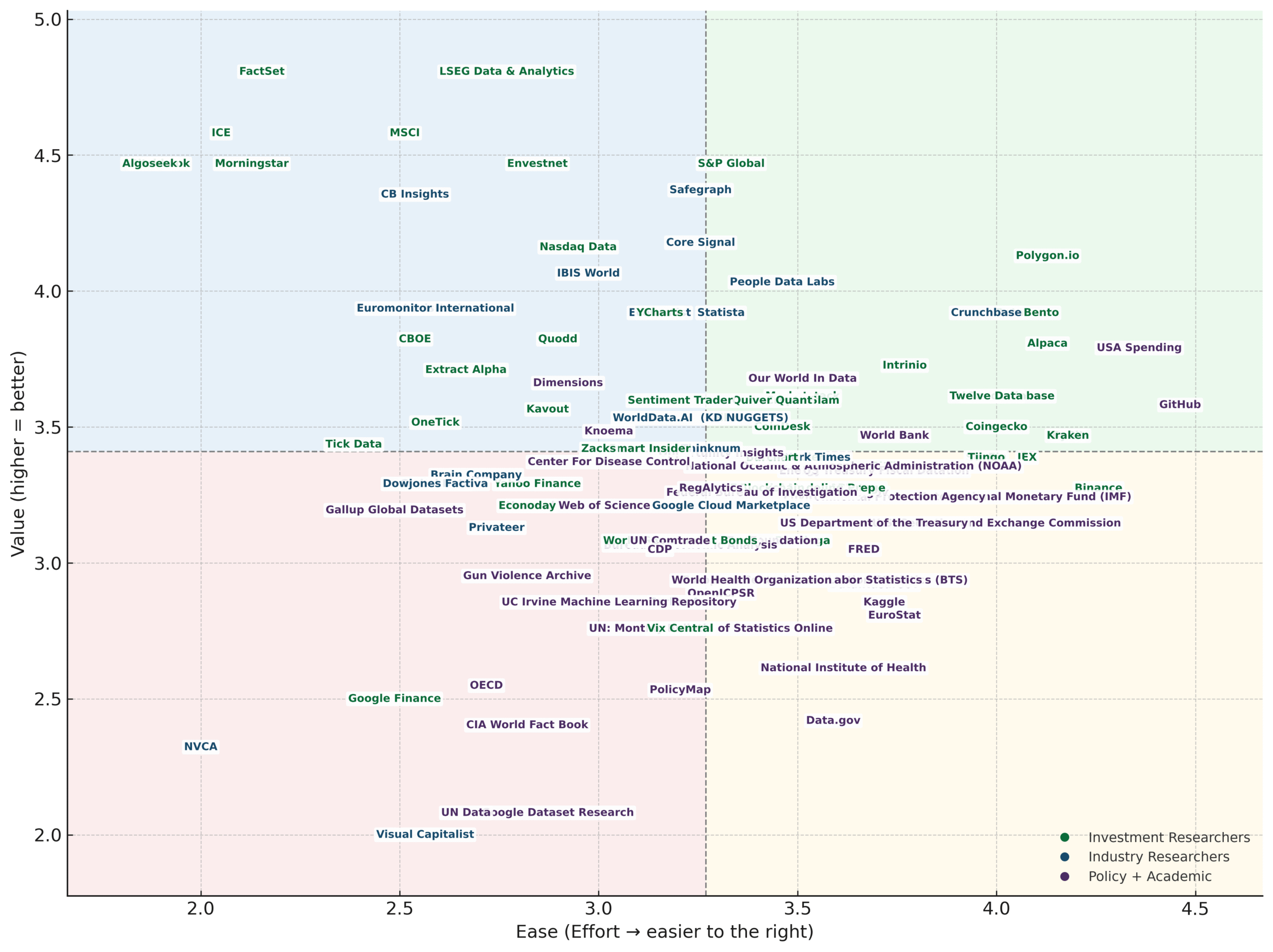
Quadrant Insights
|
Quadrant |
Shade |
Interpretation |
|
💎 Quick Wins |
🟩 |
High Value + High Ease — prioritize first; easy integrations that deliver strong differentiation and business impact. |
|
🚀 Strategic Bets |
🟦 |
High Value + Low Ease — invest engineering effort; complex feeds with high potential payoff or exclusivity. |
|
⚙️ Fillers |
🟨 |
Low Value + High Ease — maintain only if cost-effective; simple integrations with limited uniqueness. |
|
⏳ Defer / Reassess |
🟥 |
Low Value + Low Ease — lowest priority; complex or inconsistent sources offering minimal return. |
💎 Quick Wins — High Value + High Ease
These feeds deliver strong strategic value while requiring minimal engineering effort, making them prime candidates for early integration. Examples include Polygon.io, Alpaca, GitHub, USA Spending, and Twelve Data—all of which offer modern REST APIs, consistent schemas, and reliable uptime. These sources expand coverage quickly without adding operational burden.
🚀 Strategic Bets — High Value + Low Ease
Feeds in this quadrant offer significant payoff but come with substantial implementation complexity. This category includes institutional-grade vendors like S&P Global, MSCI, FactSet, LSEG Data & Analytics, as well as government-heavy sources like World Bank, IMF, and NOAA. These datasets are highly valuable, often exclusive, but require careful handling due to fragmentation, authentication complexity, or legacy architectures. They are worth the investment—just not trivial.
⚙️ Fillers — Low Value + High Ease
These integrations are technically simple but offer modest differentiation. Examples include Google Finance, OECD, CIA World Fact Book, and National Institute of Health (NIH) datasets. They’re useful for completeness or public reference data, but they rarely provide competitive advantage. Integrate only when they fill a specific user need or help support broader analytical workflows.
🪶 Defer / Reassess — Low Value + Low Ease
Feeds in this category combine low strategic return with high engineering burden and should generally be deprioritized. Examples include sources like Visual Capitalist, Data.gov, UN Dataglove, and PolicyMap, which offer limited uniqueness and inconsistent structure. These sources often require cleanup, mapping, or manual normalization that outweighs their actual value.
What This Means for Our Roadmap
-
Quick Wins give us immediate traction with minimal cost.
-
Strategic Bets require investment but unlock the most powerful differentiation.
-
Fillers should be added only when justified by user needs.
-
Defer/Reassess sources should remain off the roadmap unless their value proposition changes.
This quadrant mapping ensures we allocate engineering time where it compounds—toward feeds that offer the highest payoff relative to effort.
Feed Source Integration by Audience Segment
To understand how different user groups benefit from various data feeds, we evaluated value across five weighted criteria: uniqueness, availability, uniformity, cost quality, and scalability. Each persona—Investment Researchers, Industry Researchers, and Academics & Policy Makers—shows distinct strengths based on the nature of the datasets they rely on. These differences reveal where Plotter can deliver the most impact and which feeds offer the greatest strategic return for each audience.
💎 VALUE CRITERIA (Σ ≈ 0.61 of Model Weight)
|
Criterion (Weight) |
Investment Researchers |
Industry Researchers |
Academics & Policy Makers |
Implication |
|
ChatGPT Coverage (0.20) |
3.45 🥈 |
3.82 🥇 |
2.95 🥉 |
Industry leads in uniqueness and proprietary content — key differentiator. |
|
Data Availability (0.14) |
4.25 🥇 |
3.60 🥉 |
4.05 🥈 |
Investment data has deepest historical + real-time coverage. |
|
Data Uniformity (0.12) |
3.88 🥇 |
3.50 🥈 |
3.16 🥉 |
Investment feeds have most consistent schemas → lowest ETL effort. |
|
Cost Value = 6−Cost (0.09) |
2.80 🥈 |
3.18 🥇 |
1.40 🥉 |
Paid industry feeds deliver stronger reliability and data quality. |
|
Scalability (0.07) |
3.70 🥇 |
3.40 🥈 |
3.25 🥉 |
Investment APIs are most ready for enterprise-scale ingestion. |
✔️ Investment Researchers — Highest Overall Value
Investment datasets lead in Data Availability (4.25) and Data Uniformity (3.88), reflecting their rich historical depth, real-time refresh rates, and consistent schemas. They also show strong scalability (3.70), meaning they integrate smoothly into enterprise-grade ingestion pipelines. Although cost value is lower due to licensing fees, their uniqueness and proprietary content create unmatched differentiation for financial workflows.
⚙️ Industry Researchers — Strong Uniqueness & Balanced Value
Industry researchers score highest on ChatGPT Coverage/Uniqueness (3.82), indicating that their feeds often provide specialized or proprietary industry intelligence not easily replicated by open models. Their data availability is solid (3.60), though less comprehensive than investment data. Uniformity is moderate, suggesting more variation in formats and metadata across industry sources.
🏛 Academics & Policy Makers — Accessible but Less Standardized
Academic and policy feeds excel in availability (4.05) and are often free or open, but lag in data uniformity (3.16) and cost value (1.40) due to inconsistent schemas or weaker reliability guarantees. While these sources are excellent for breadth and transparency, they require more ETL standardization to deliver analysis-ready data compared to the more structured investment datasets.
⚙️ EFFORT CRITERIA (Σ ≈ 0.39 of Model Weight)
Effort measures the engineering difficulty of integrating each feed across six criteria: implementation complexity, cost friction, documentation quality, connectivity, authentication, and data size. Each persona group exhibits its own integration profile, revealing where Plotter can onboard data quickly versus where more technical investment is required.
|
Criterion (Weight) |
Investment Researchers |
Industry Researchers |
Academics & Policy Makers |
Implication |
|
Implementation Complexity (0.18) |
3.20 🥇 |
3.00 🥈 |
2.85 🥉 |
Investment feeds are simplest to implement and maintain. |
|
Cost Effort (0.08) |
3.10 🥈 |
2.95 🥉 |
4.60 🥇 |
Academic feeds win on ease of access (free/open). |
|
Integration Readiness (0.06) |
3.57 🥇 |
3.18 🥉 |
3.33 🥈 |
Better documentation and SDKs speed integration for Investment feeds. |
|
Connectivity (0.04) |
3.79 🥇 |
3.50 🥈 |
3.25 🥉 |
RESTful APIs dominate for Investment + Industry sources. |
|
Authentication (0.02) |
3.25 🥈 |
3.23 🥉 |
3.93 🥇 |
Simpler auth for Academic feeds supports faster onboarding. |
|
Data Size (0.01) |
2.71 🥇 |
2.68 🥈 |
2.67 🥉 |
Smaller feed volumes in Investment data reduce infrastructure load. |
✔️ Investment Researchers — Lowest Integration Effort
Investment feeds score highest on Implementation Complexity (3.20) and Integration Readiness (3.57), reflecting mature documentation, predictable schemas, and enterprise-grade APIs. Connectivity scores are exceptional (3.79), driven by REST-first designs and robust infrastructure from financial vendors. Although these feeds have licensing costs, they require the least engineering work overall.
⚙️ Industry Researchers — Moderate Effort with Some Friction
Industry datasets present slightly more engineering challenges with moderate complexity (3.00) and average integration readiness (3.18). Their APIs are relatively modern but vary widely in structure. Documentation is often serviceable but not as polished as investment providers. Connectivity remains strong due to REST-based endpoints (3.50), but the variation across vendors introduces additional overhead.
🏛 Academics & Policy Makers — Easiest Access, Hardest Cleanup
These sources offer the lowest cost effort (4.60) thanks to free, open-access data—an attractive starting point for many teams. However, they often require more transformation work due to lower authentication barriers (3.93) and inconsistent integration readiness (3.33). While easy to retrieve, these feeds tend to lack the uniformity and structure needed for seamless ingestion.
🏆 SEGMENT RANKINGS SUMMARY
By combining each persona’s Value and Effort scores into a weighted overall ranking, we can identify which user segments offer the greatest strategic opportunity for Plotter. The rankings highlight not only which feeds yield the best return on engineering investment but also where product expansion will generate the strongest user impact.
|
Segment |
Value Score |
Ease Score |
Combined Score |
🥇 Gold Medals |
Rank |
Strategic Takeaway |
|
💹 Investment Researchers |
3.64 |
3.28 |
3.50 |
7 🥇 |
🥇 1st |
Best overall profile — top data maturity, structure, and readiness. |
|
⚙️ Industry Researchers |
3.53 |
2.98 |
3.31 |
4 🥇 |
🥈 2nd |
Strong uniqueness and cost value; friction from integration complexity. |
|
🏛 Academics & Policy Makers |
3.05 |
3.40 |
3.19 |
2 🥇 |
🥉 3rd |
Cost-efficient and accessible, but weaker in quality and uniformity. |
🥇 Investment Researchers — 1st Place (Best Overall Profile)
Investment Researchers achieve the top ranking due to their exceptional data maturity, high-quality schemas, strong real-time availability, and robust API consistency. They deliver the clearest ROI for integration work and form the strongest foundation for premium product offerings.
🥈 Industry Researchers — 2nd Place (High Strategic Potential)
Industry datasets offer strong uniqueness and proprietary insight, making them strategically valuable. Their main drawback is integration friction—more varied documentation, schemas, and metadata than investment feeds. With targeted tooling, this segment becomes a powerful strategic expansion path.
🥉 Academics & Policy Makers — 3rd Place (Broadest Access)
Academic and policy sources excel in accessibility and low cost, but their inconsistent structure weakens both analytical readiness and integration reliability. These feeds are excellent for foundational context or public-sector analysis, but require more transformation for enterprise workflows.
Conclusion
This analysis gives Plotter a clear, data-driven roadmap for which feeds to integrate and when. By evaluating every source through the lenses of Value, Effort, and user-segment relevance, we can prioritize integrations that deliver the strongest return while avoiding low-impact, high-cost work. The results highlight a consistent pattern: Investment Research feeds offer the best overall payoff, Industry feeds provide high-value strategic opportunities despite added complexity, and Academic feeds maximize accessibility but require more normalization.